Up and running with pcaExplorer
Federico Marini
Institute of Medical Biostatistics, Epidemiology and Informatics (IMBEI), MainzCenter for Thrombosis and Hemostasis (CTH), Mainzmarinif@uni-mainz.de
Harald Binder
Institute of Medical Biostatistics, Epidemiology and Informatics (IMBEI), Mainz1 December 2025
Source:vignettes/upandrunning.Rmd
upandrunning.Rmd
knitr::opts_chunk$set(crop = NULL)Setup
First things first: install pcaExplorer and load it into your R session. You should receive a message notification if this is completed without errors.
BiocManager::install("pcaExplorer")
library("pcaExplorer")
This document describes a use case for pcaExplorer, based on the dataset in the airway package. If this package is not available on your machine, please install it by executing:
BiocManager::install("airway")This dataset consists of the gene-level expression measurements (as raw read counts) for an experiment where four different human airway smooth muscle cell lines are either treated with dexamethasone or left untreated.
Start exploring - the beauty of interactivity
To start the exploration, you just need the following lines:
The easiest way to explore the airway dataset is by clicking on the dedicated button in the Data Upload panel. This action will:
- load the airway package
- load the count matrix and the experimental metadata
- compose the
ddsobject, normalize the expression values (using the robust method proposed by Anders and Huber in the original DESeq manuscript), and compute the variance stabilizing transformed expression values (stored in thedstobject) - retrieve the gene annotation information via the org.Hs.eg.db, adding gene symbols to the ENSEMBL ids - this step is optional, but recommended for more human-readable identifiers to be used.
If you want to load your expression data, please refer to the User Guide, which contains detailed information on the formats your data have to respect.
Once the preprocessing of the input is done, you should get a notification in the lower right corner that you’re all set. The whole preprocessing should take around 5-6 seconds (tested on a MacBook Pro, with i7 and 16 Gb RAM). You can check how each component looks like by clicking on its respective button, once they appeared in the lower half of the panel.
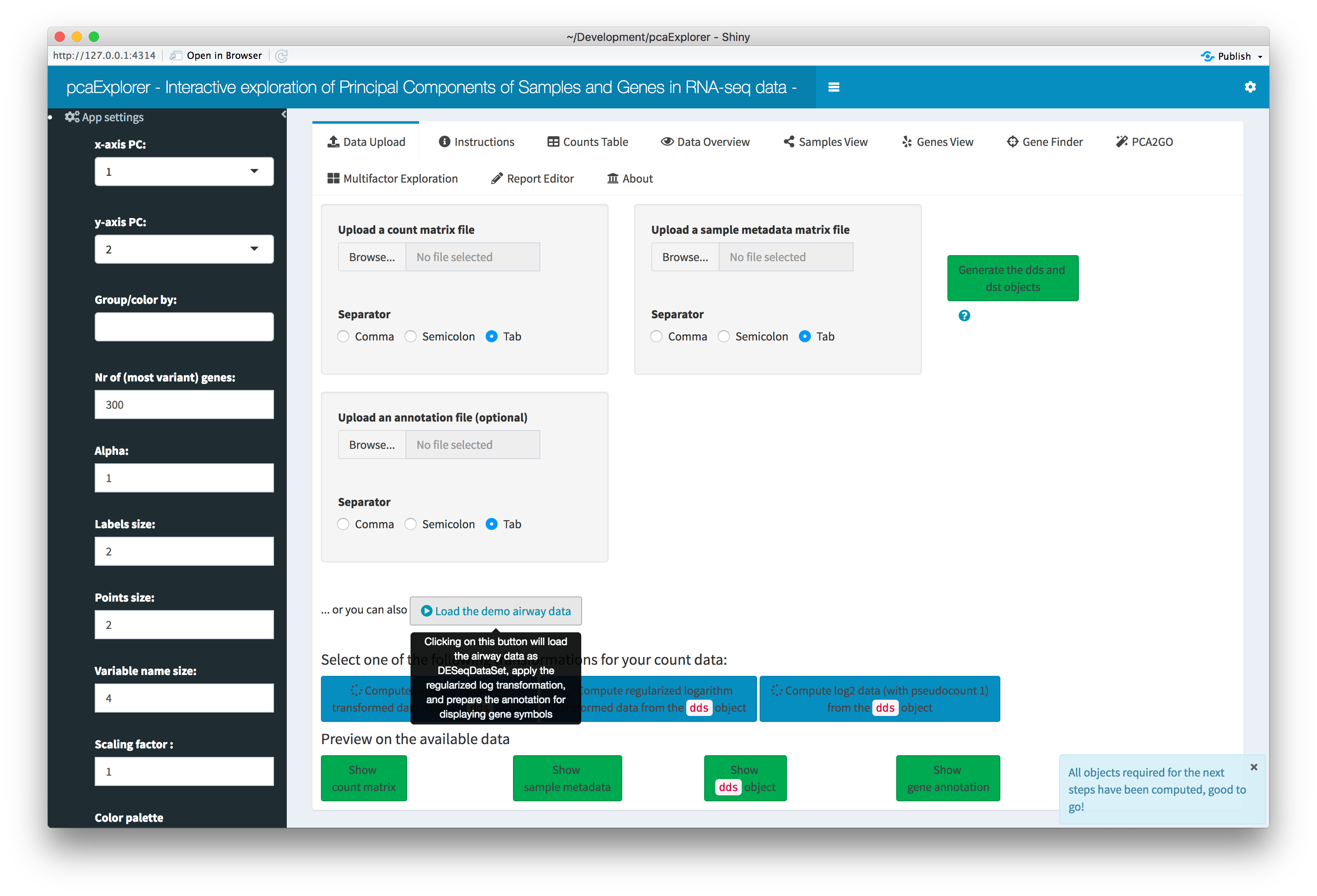
Overview of the Data Upload panel. After clicking on the ‘Load the demo airway data’ button, all widgets are automatically populated, and each data component (count matrix, experimental data, dds object, annotation) can be previewed in a modal window by clicking on its respective button.
You can proceed to explore the expression values of your dataset in
the Counts Table tab. You can change the data type you
are displaying between raw counts, normalized, or transformed, and plot
their values in a scatterplot matrix to explore their sample-to-sample
correlations. To try this, select for example “Normalized counts”,
change the correlation coefficient to “spearman”, and click on the
Run action button. The correlation values will also be
displayed as a heatmap.
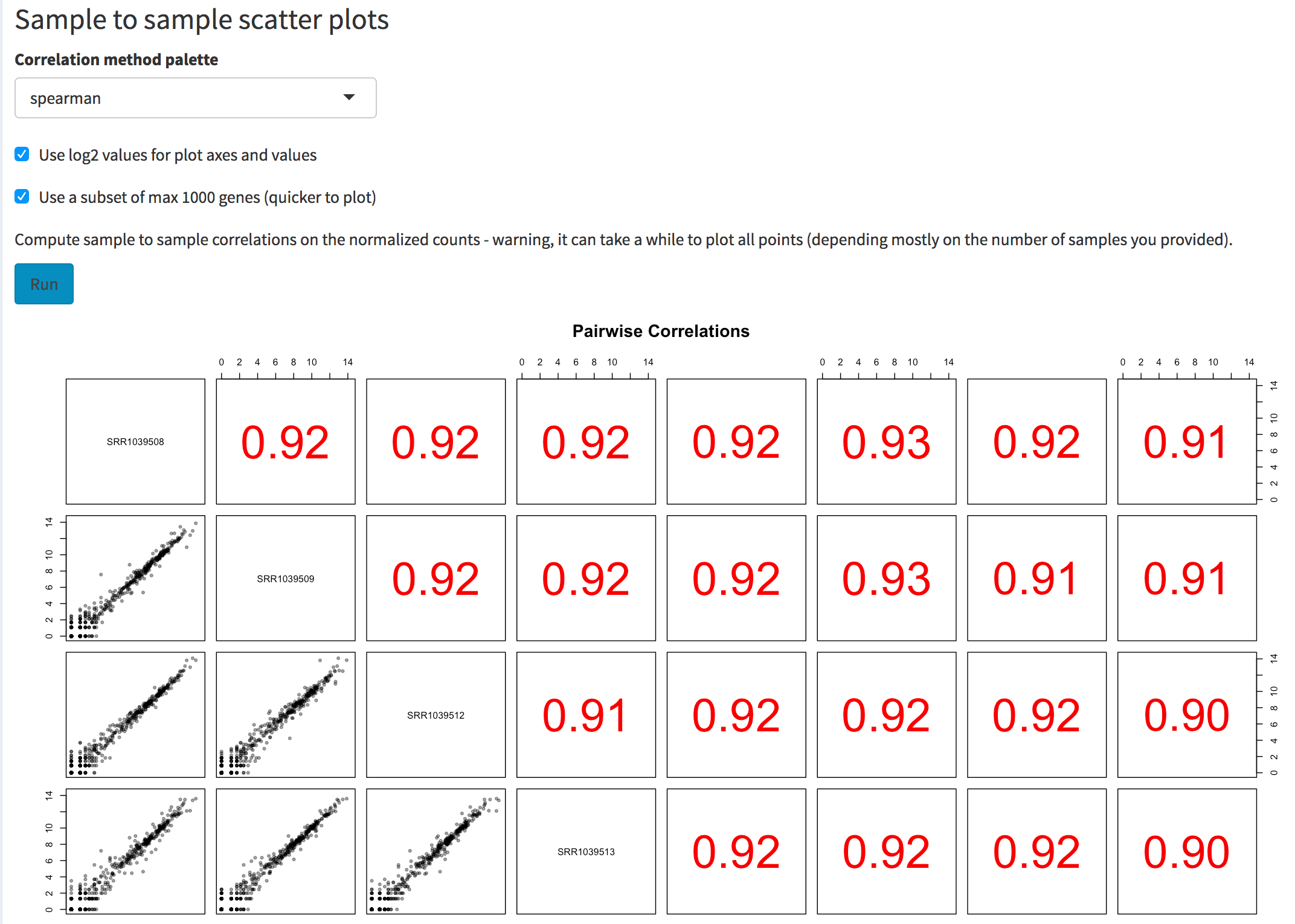
Screenshot of the sample to sample scatter plot matrix. The user can select the correlation method to use, the option to plot values on log2 scales, and the possibility to use a subset of genes (to obtain a quicker overview if many samples are provided).
Additional features, both for samples and for features, are displayed
in the Data overview panel. A closer look at the
metadata of the airway set highlights how each combination
of cell type (cell) and dexamethasone treatment
(dex) is represented by a single sequencing experiment. The
8 samples in the demo dataset are themselves a subsample of the full
GEO record, namely the ones non treated with albuterol
(alb column).
The relationship among samples can be seen in the sample-to-sample heatmap. For example, by selecting the Manhattan distance metric, it is evident how the samples cluster by dex treatment, yet they show a dendrogram structure that recalls the 4 different cell types used. The total sum of counts per sample is displayed as a bar plot.
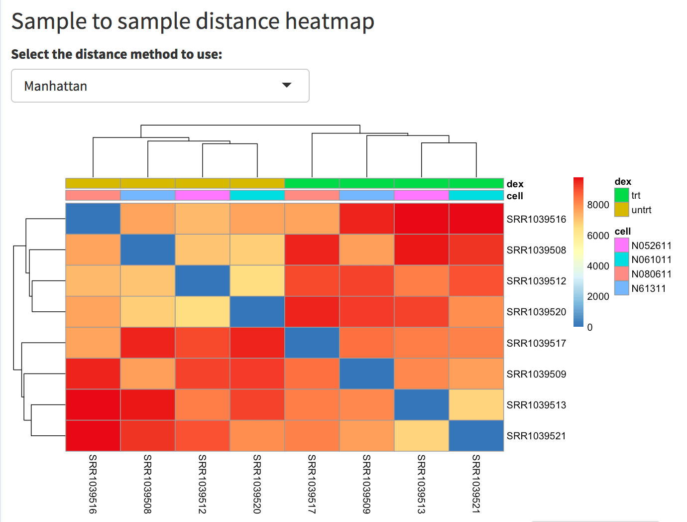
Screenshot of the sample to sample heatmap. Selected is the Manhattan distance, but Euclidean and correlation-based distance are also provided as options. In this case, the user has also selected the dex and cell factors in the ‘Group/color by’ widget in the sidebar menu, and these covariates decorate the heatmap to facilitate identification of patterns.
Patterns can become clearer after selecting, in the App
settings on the left, an experimental factor to group and color
by: try selecting dex, for example. If more than one
covariate is selected, the interaction between these will be taken as a
grouping factor. To remove one, simply click on it to highlight and
press the del or backspace key to delete it. Try doing so by also
clicking on cell, and then removing dex
afterwards.
Basic summary information is also displayed for the genes. In the count matrix provided, one can check how many genes were detected, by selecting a “Threshold on the row sums of the counts” or on the row means of the normalized counts (more stringent). For example, selecting 5 in both cases, only 24345 genes have a total number of counts, summed by row, and 17745 genes have more than 5 counts (normalized) on average.
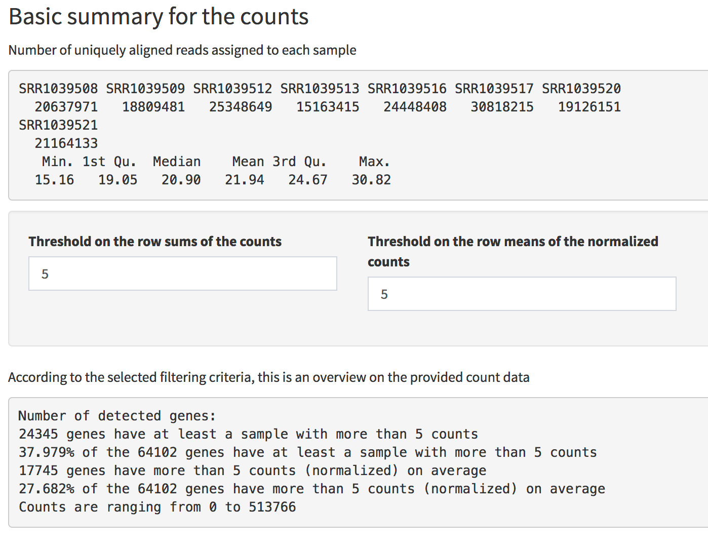
Screenshot of the Basic Summary of the counts in the Data Overview panel. General information are provided, together with an overview on detected genes according to different filtering criteria.
The Samples View and the Genes View
are the tabs where most results coming from Principal Component
Analysis, either performed on the samples or on the genes, can be
explored in depth. Assuming you selected cell in the
“Group/color by” option on the left, the Samples PCA plot should clearly
display how the cell type explain a considerable portion of the
variability in the dataset (corresponding to the second PC). To check
that dex treatment is the main source of variability,
select that instead of cell.
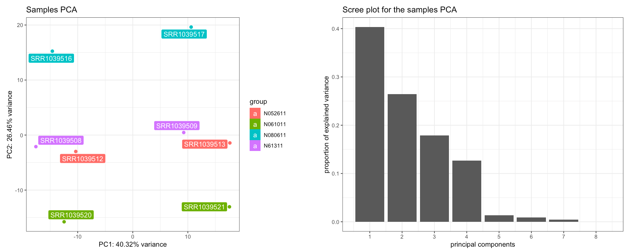
The Samples View panel. Displayed are a PCA plot (left) and the corresponding scree plot (right), with the samples colored and labeled by cell type - separating on the second principal component.
The scree plot on the right shows how many components should be retained for a satisfactory reduced dimension view of the original set, with their eigenvalues from largest to smallest. To explore the PCs other than the first and the second one, you can just select them in the x-axis PC and y-axis PC widgets in the left sidebar.
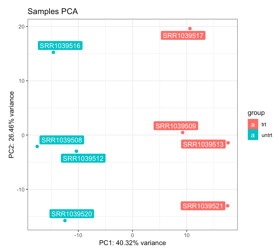
PCA plot for the samples, colored by dexamethasone treatment. The dex factor is the main driver of the variability in the data, and samples separate nicely on the first principal component.
If you brush (left-click and hold) on the PCA plot, you can display a
zoomed version of it in the frame below. If you suspect some samples
might be outliers (this is not the case in the airway set,
still), you can select them in the dedicated plot, and give a first
check on how the remainder of the samples would look like. On the right
side, you can quickly check which genes show the top and bottom
loadings, split by principal component. First, change the value in the
input widget to 20; then, select one of each list and try to check them
in the Gene Finder tab; try for example with
DUSP1, PER1, and DDX3Y.
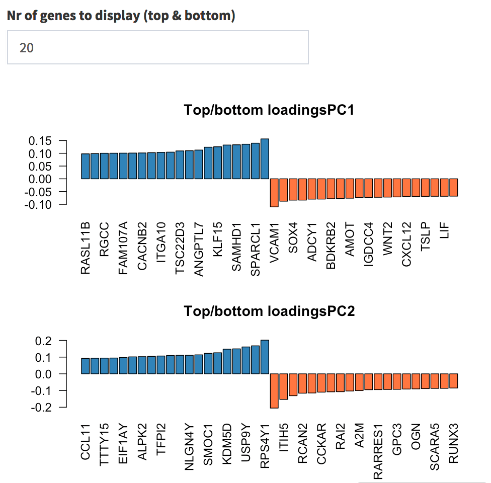
Genes with highest loadings on the first and second principal components. The user can select how many top and bottom genes will be displayed, and the gene names are printed below each gene’s contribution on each PC.
While DUSP1 and PER1 clearly show a change in
expression upon dexamethasone treatment (and indeed where reported among
the well known glucocorticoid-responsive genes in the original
publication of Himes et al., 2014), DDX3Y displays variability
at the cell type level (select cell in the Group/color by
widget): this gene is almost undetected in N061011 cells, and this high
variance is what determines its high loading on the second principal
component.
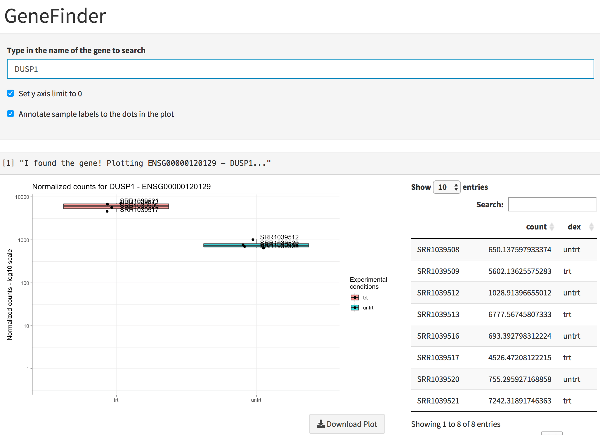
Plot of the gene expression levels of DUSP1. Points are split according to dex treatment, and both graphics and table are displayed.
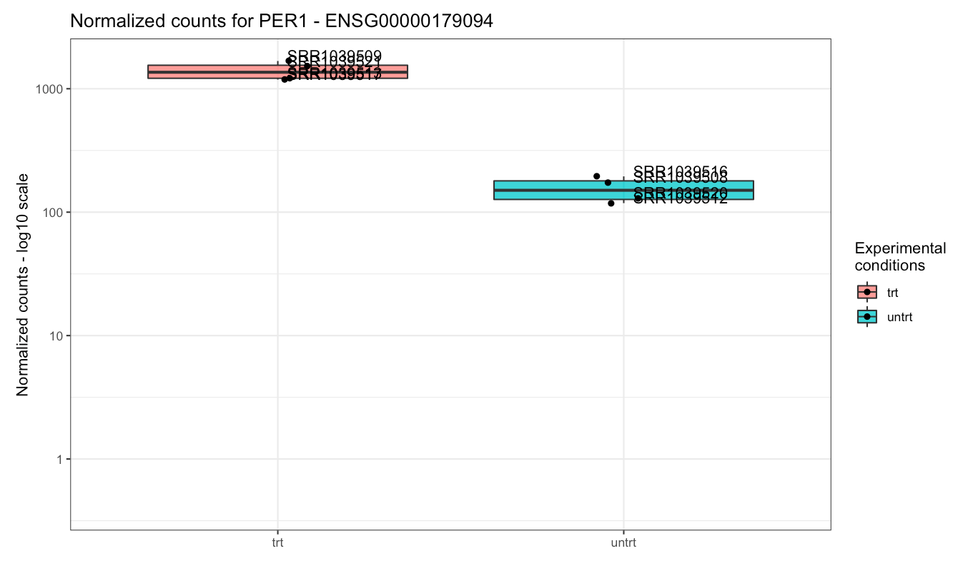
Plot of the gene expression levels of PER1. Points are split according to dex treatment.
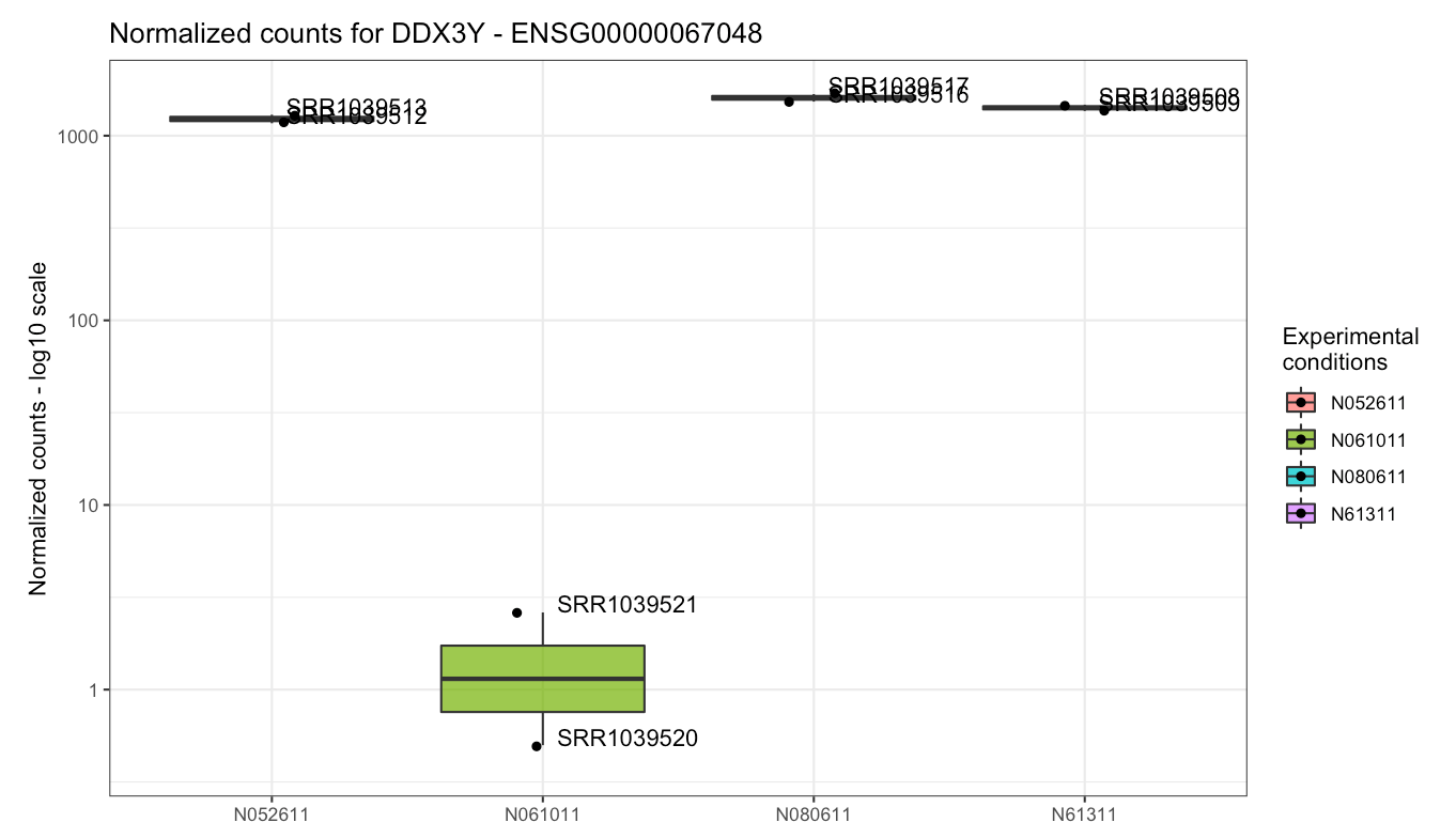
Plot of the gene expression levels of DDX3Y. Points are split according to cell type, as this gene was highly variable across this experimental factor - indeed, in one cell type it is barely detected.
You can see the single expression values in a table as well, and this information can be downloaded with a simple click.
Back to the Samples View, you can experiment with the number of top variable genes to see how the results of PCA are in this case robust to a wide range of this value - this might not be the case with other datasets, and the simplicity of interacting with these parameters makes it easy to iterate in the exploration steps.
Proceeding to the Genes View, you can see the dual of the Samples PCA: now the samples are displayed as arrows in the genes biplot, which can show which genes display a similar behaviour. You can capture this with a simple brushing action on the plot, and notice how their profiles throughout all samples are shown in the Profile explorer below; moreover, a static and an interactive heatmap, together with a table containing the underlying data, are generated in the rows below.
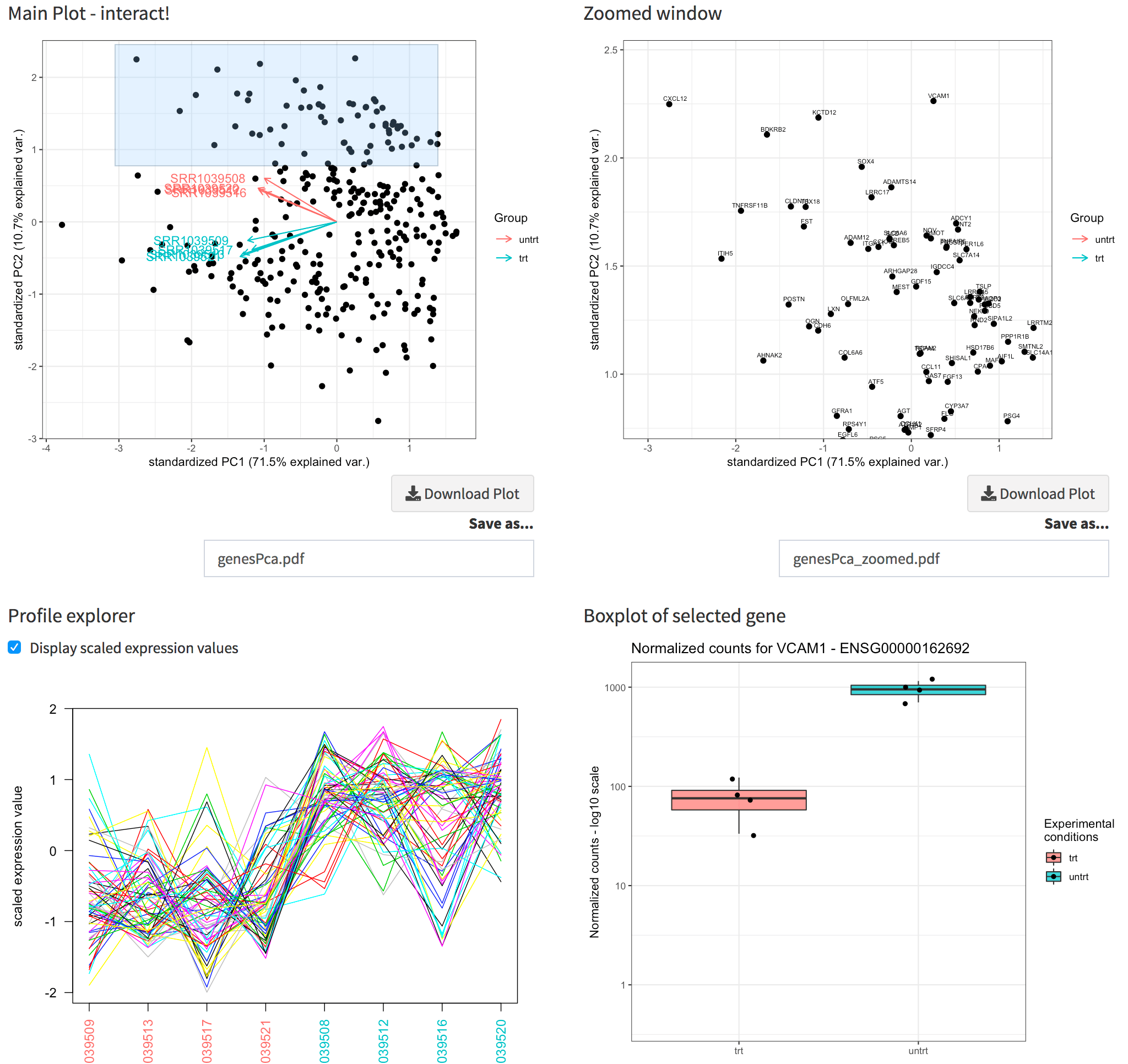
The Genes View panel. Upper panel: the genes biplot, and its zoomed plot, with gene names displayed. Lower panel: the profile explorer of the selected subset of genes (corresponding to the zoomed window), and the boxplot for the gene selected by clicking close to a location in the zoomed window.
Since we compute the gene annotation table as well, it’s nice to read the gene symbols in the zoomed window (instead of the ENSEMBL ids). By clicking close enough to any of these genes, the expression values are plotted, in a similar fashion as in the Gene Finder.
The tab PCA2GO helps you understanding which are the
biological common themes (default: the Gene Ontology Biological Process
terms) in the genes showing up in the top and in the bottom loadings for
each principal component. Since we launched the pcaExplorer
app without additional parameters, this information is not available,
but can be computed live (this might take a while).
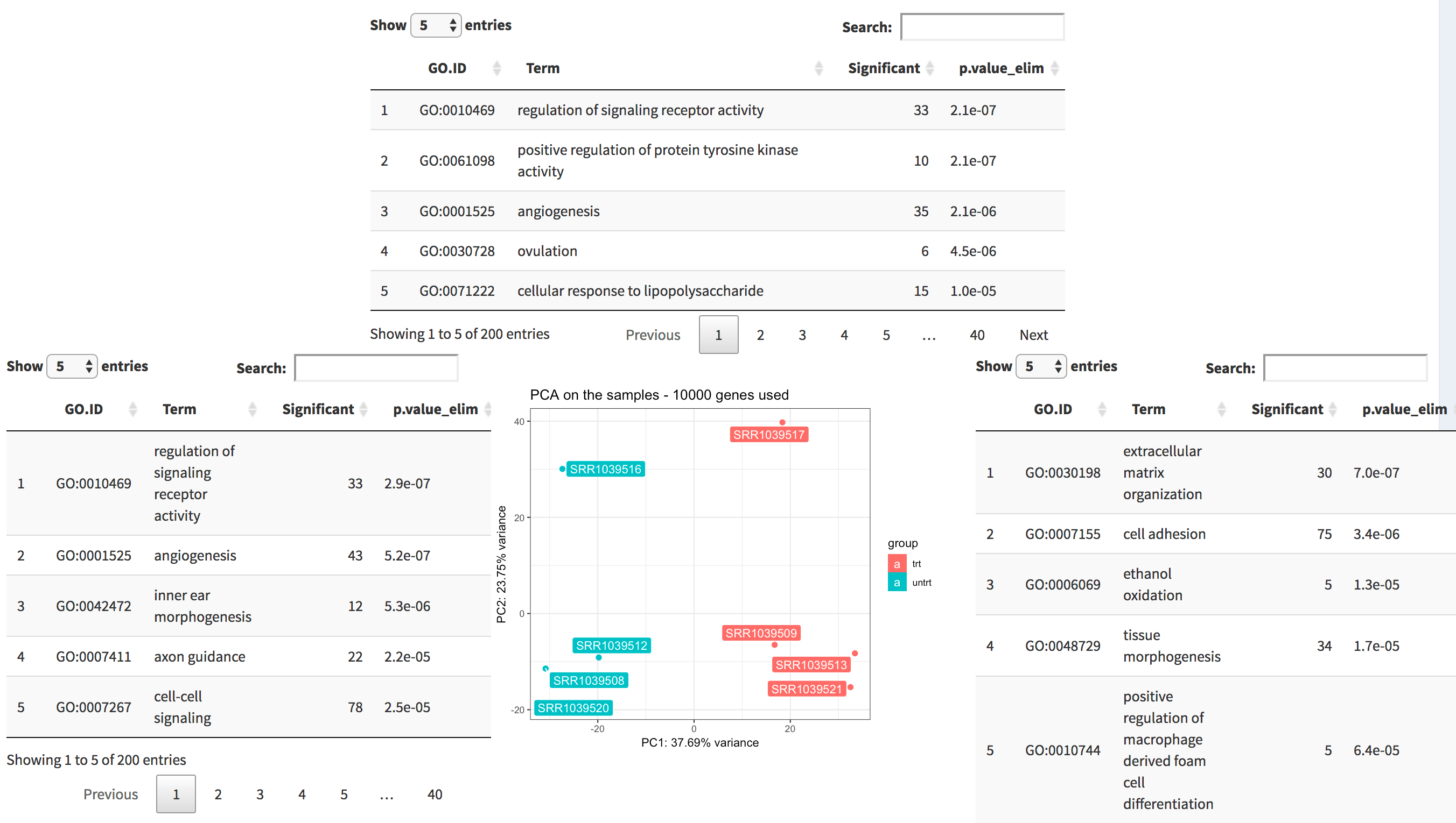
The PCA2GO panel. Four tables (2 per dimension, here only 3 are displayed) decorate the PCA plot in the middle, and display the top enriched functional categories in each subset of gene with high loadings.
Still, a previous call to pca2go is recommended, as it
relies on the algorithm of the topGO
package: it will require some additional computing time, but it is
likely to deliver more precise terms (i.e. in turn more relevant from
the point of view of their biological relevance). To do so, you should
exit the live session, compute this object, and provide it in the call
to pcaExplorer (see more how to do so in the
main user guide).
When you’re done - the power of reproducibility
A typical session with pcaExplorer includes one or more
iterations on each of these tabs. Once you are finished, you might want
to store the results of your analysis in different formats.
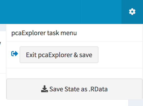
The pcaExplorer task menu. Buttons for saving the session to binary data or to a dedicated environment are displayed.
With pcaExplorer you can do all of the following:
- save every plot and table by simply clicking on the respective button, below each element
- save the state of the entire app and its reactive elements as a
binary
.RDatafile, as if it was a workspace (clicking on the cog icon in the right side of the task menu) - use the “Exit
pcaExplorerand save” saves the state but in a specific environment of your R session, which you can later access by its name, which normally could look likepcaExplorerState_YYYYMMDD_HHMMSS(also accessible from the cog) - enjoy the beauty of reproducible research in the Report
Editor:
pcaExplorercomes with a template analysis, that picks the latest status of the app during your session, and combines these reactive values together in a R Markdown document, which you can first preview live in the app, and then download as standalone HTML file - to store or share. This document stiches together narrative text, code, and output objects, and constitutes a compendium where all actions are recorded. If you are familiar with R, you can edit that live, with support for autocompletion, in the “Edit report” tab.
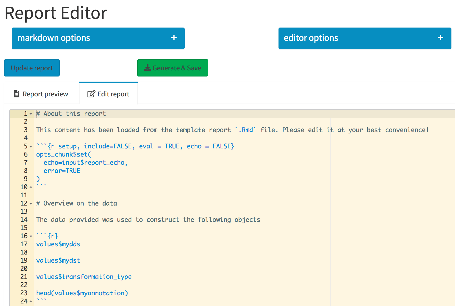
The Report Editor tab. The collapsible elements control general markdown and editor options, which are regarded when the report is compiled. Its content is specified in the Ace editor, integrated in the Shiny app.
The functionality to display the report preview is based on
knit2html, and some elements such as DataTable
objects might not render correctly. To render them correctly, please
install the PhantomJS executable before launching the app. This can be
done by using the webshot
package and calling webshot::install_phantomjs() - HTML
widgets will be rendered automatically as screenshots. Alternatively,
the more recent webshot2
package uses the headless Chrome browser (via the chromote
package, requiring Google Chrome or other Chromium-based browser). Keep
in mind that the fully rendered report (the one you can obtain with the
“Generate & Save” button) is not affected by this, since it uses
rmarkdown::render().
Session Info
## R Under development (unstable) (2025-11-24 r89053)
## Platform: aarch64-apple-darwin20
## Running under: macOS Sequoia 15.7.2
##
## Matrix products: default
## BLAS:   /System/Library/Frameworks/Accelerate.framework/Versions/A/Frameworks/vecLib.framework/Versions/A/libBLAS.dylib
## LAPACK: /Library/Frameworks/R.framework/Versions/4.6-arm64/Resources/lib/libRlapack.dylib;  LAPACK version 3.12.1
##
## locale:
## [1] en_US.UTF-8/en_US.UTF-8/en_US.UTF-8/C/en_US.UTF-8/en_US.UTF-8
##
## time zone: UTC
## tzcode source: internal
##
## attached base packages:
## [1] stats     graphics  grDevices utils     datasets  methods   base
##
## other attached packages:
## [1] BiocStyle_2.39.0
##
## loaded via a namespace (and not attached):
##  [1] digest_0.6.39       desc_1.4.3          R6_2.6.1
##  [4] bookdown_0.45       fastmap_1.2.0       xfun_0.54
##  [7] cachem_1.1.0        knitr_1.50          htmltools_0.5.8.1
## [10] png_0.1-8           rmarkdown_2.30      lifecycle_1.0.4
## [13] cli_3.6.5           sass_0.4.10         pkgdown_2.2.0.9000
## [16] textshaping_1.0.4   jquerylib_0.1.4     systemfonts_1.3.1
## [19] compiler_4.6.0      tools_4.6.0         ragg_1.5.0
## [22] bslib_0.9.0         evaluate_1.0.5      yaml_2.3.10
## [25] BiocManager_1.30.27 jsonlite_2.0.0      rlang_1.1.6
## [28] fs_1.6.6            htmlwidgets_1.6.4